Working with the research collected on Terry Gilliam our brief is to create 3 posters 2:1 on A3 paper using only 2 colours and 1 stock. I must convey and interpret a message through a series of 3 posters, the message must be a.. Statement Of Fact..which is
Terry Gilliam has directed 17 films
1 Type poster, 1 Image poster, 1 Type and Image poster.
I started by looking at the style of his work, illustration, animation, themes in films. I researched fonts used for the titles of his films and tried to match them up as close as possible. I thought this could be a good foundation to build a type based poster upon.
 i
iI gathered the titles of all the films he has directed from the research in the last part of the brief and chose the corresponding type, a played around alot with the layout of the type on the page to see how they would best fit together. I liked the idea of a mix of font and size.
Following on from the pure type poster I have selected the most interesting typefaces to create Gilliam's name with, i would like to add to this to turn it into a type and image piece. I like the message that is conveyed through this, the imagination makes gilliam.
Image only poster, i wanted to express Gilliams style of illustration and crazy animation, i did this by collecting images from his films, drawing them then scanning them in and playing with the layout to place them together.
Sketchbook planning pages...
The feedback from my work was very negative, the message was not clear enough and they didn't like the style in which i had worked in. I do agree with the piece being unclear but i think that is because it was looked at by the wrong audience... these pieces are targetted at people who know of Gilliam and his work and it promotes his other films and his imagination. The style of his work is pretty crazy, lavish colours and psychedelic which i think i have displayed well in the posters.
I thought that the list of films would identify what/ who Gilliam was.. Monty Python and Fear and Loathing were big clues to what the posters were about, especially with the illustrations too but only a certain audience would pick up on this.
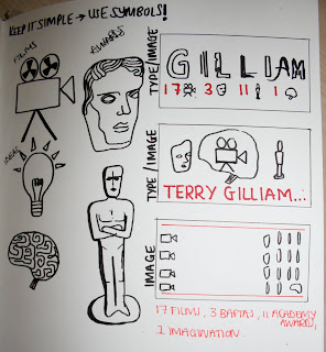
I chose to develop my statement of fact as i didn't have enough information to work with and it would give the reader more to work with so even if they didn't know who he was they knew he has something to do with film.. it is now
Terry Gilliam has directed 17 films won 3 baftas and 11 academy awards.
I have also decided to go back to the list of symbols and images and see which ones i could use to simplify the piece as the feedback was that there was too much going on in the piece it was visually busy and difficult to interpret.
This are my improved pieces.


No comments:
Post a Comment