I drew a few different variations of the key imagery before choosing which ones to take forward into the design.
Puffin provided the template to work to so I started to work straight onto the layout given.
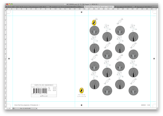
I added the circles below to show where the cut outs would be, this helped to line up the illustrations and make sure none of them crossed over.
Finished layouts for illustrations..... I've shown how they would be viewed on the book but their actually printed layout both sets of illustrations would be on the same page.
Starting to add colour
Black background? I feel it looks abit too much for the small illustrations, but I will play around with coloured backgrounds later on.
The illustrations were proving difficult to colour in using photoshop so I decided to create vectors from them in illustrator.
Finished layout with vectored illustrations instead of just handrawn, I feel that the covers look quite simple, yet maybe this will change when i see the book in motion. Also it still needs the title on so this will add more to the design too.


No comments:
Post a Comment