Info (300 words)
Paul Brandreth- BA Graphic Design
An insight into the young designer and a year of creative type
This young emerging talent started studying Btec in Graphic Design in Nottingham where he found a passion for the subject and took his studies further to gain a place on the BA Graphic Design course at the well established College of Art & Design in Leeds. Here he has studied a broad range of styles and media and his work has become directed to packaging and especially type.
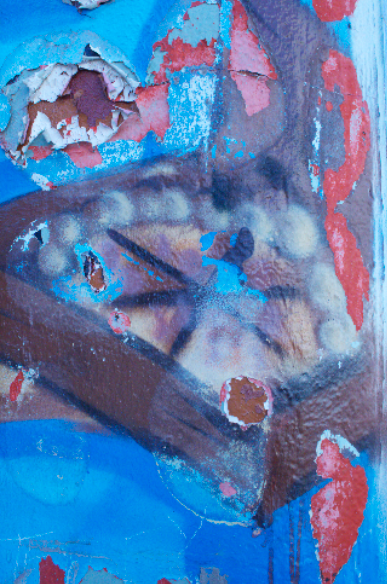
His style has become focused on hand drawn illustrative type influenced by his passion for music, travel and street art which is reflected in his work. He has developed an interactive, playful alphabet of his own typography which connects together by hand to make a string of letters. The letters are 3D and made from card covered with graffiti, illustrations and images expressing his personality making his work very personal.
“I find hand drawn type so inspirational, I love how no two designs can ever be the same. Its so unique and personal!”
Influential designers in his life are Stylefile Magazine for ideas with type and editorial layouts, Vladstudio and Julia Sonmi Heglund for creative illustrative type. Paul is also very interested in Street Art, the graffiti artist ‘Rime’ has influenced him a lot as a designer as it too is very personal –tagging creating their own identity and is very elaborative type.
Paul’s most recent pieces show how his style has developed and how he has become more professional. His range of fast food posters show a comprehensive understanding of illustrative type, which he has gained throughout year 1. They are fun, playful and appropriate for the subject also his skills on Photoshop have aided him with the professional appearance of his work.
An insight into the young designer and a year of creative type
This young emerging talent started studying Btec in Graphic Design in Nottingham where he found a passion for the subject and took his studies further to gain a place on the BA Graphic Design course at the well established College of Art & Design in Leeds. Here he has studied a broad range of styles and media and his work has become directed to packaging and especially type.
His style has become focused on hand drawn illustrative type influenced by his passion for music, travel and street art which is reflected in his work. He has developed an interactive, playful alphabet of his own typography which connects together by hand to make a string of letters. The letters are 3D and made from card covered with graffiti, illustrations and images expressing his personality making his work very personal.
“I find hand drawn type so inspirational, I love how no two designs can ever be the same. Its so unique and personal!”
Influential designers in his life are Stylefile Magazine for ideas with type and editorial layouts, Vladstudio and Julia Sonmi Heglund for creative illustrative type. Paul is also very interested in Street Art, the graffiti artist ‘Rime’ has influenced him a lot as a designer as it too is very personal –tagging creating their own identity and is very elaborative type.
Paul’s most recent pieces show how his style has developed and how he has become more professional. His range of fast food posters show a comprehensive understanding of illustrative type, which he has gained throughout year 1. They are fun, playful and appropriate for the subject also his skills on Photoshop have aided him with the professional appearance of his work.
Images to include


work of other type designers that Paul likes
Layout designs
I have written about Paul as a Graphic Designer, talking about his work, his influences and interests.
It reminded me of articles on designers in magazines such as Grafik, IDN and Computer Arts.
Because of this i will research those layouts as i would like to achieve a similar look
Clean, fresh, professional!
 9 Layout ideas similar to Graphic Design Journals
Paul mentioned he liked bright colours especially blue and green, although i would like to keep the colours quite simple i will use one colour for details then either black or grey background with white type for the main text.

 i cut and pasted some text from magazine of similar size to show how it would work
It reminded me of articles on designers in magazines such as Grafik, IDN and Computer Arts.
Because of this i will research those layouts as i would like to achieve a similar look
Clean, fresh, professional!

Paul mentioned he liked bright colours especially blue and green, although i would like to keep the colours quite simple i will use one colour for details then either black or grey background with white type for the main text.


i would like a fun creative font for the headline as it links with the idea of hand drawn type/ graffiti art
for the main body of text i will use a simple, clear rounded font... helvetica nueue?
for the main body of text i will use a simple, clear rounded font... helvetica nueue?
Final double page spread

showing grid and layout lines- normal view

final bleed view
I'm really happy with the final layout, it took a long time to design but i think it has paid off as it looks really professional and basing my layout on those from graphic magazines has allowed me to create the look of a designers profile.