Monday 23 November 2009

OUGD101 No News Is Good News- Message & Interpretation... Improved


These are the final resolutions to the Message & Interpretation brief, after the excellent feedback from the mail shot i decided to follow the colour and stock through to the posters. I think it works really well, the more muted red and cream paper have a richer quality and balance out the business of the posters.

Sunday 22 November 2009

OUGD101 No News Is Good News- Message & Delivery

Continuing on from the work on 'No News Is Good News' we has to create a mail shot to send out to suitable, specific audience to either Inform, Instruct, Persuade or Promote.
From the feedback i gathered on the message and interpretation it was very apparrent many people did not know who Terry Gilliam was, because of this i have chosen to promote his new film to gain recognition of his work.
I wanted the piece to be interactive and creative allowing the recipent to develop their own imagination which is one of Gilliams main targets from his own work.

Sketchbook pages


Final Piece


The mailshot was an invitation to a private showing of his new film 'The Imaginarium Of Doctor Parnassus, i was very specific with the recipents of the invitation, targetting people that would appreciate and understand his work and explore it.

I tried to keep the mailing list to the same theme as the invitation, using the same stock, colours, type and images.

OUGD101 No News Is Good News- Message & Interpretation

Working with the research collected on Terry Gilliam our brief is to create 3 posters 2:1 on A3 paper using only 2 colours and 1 stock. I must convey and interpret a message through a series of 3 posters, the message must be a.. Statement Of Fact..which is
Terry Gilliam has directed 17 films

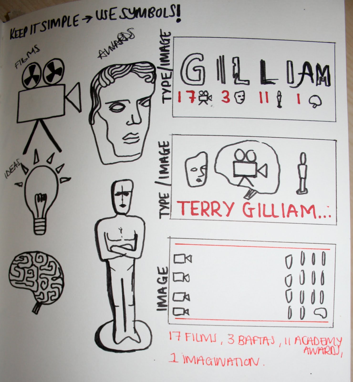
1 Type poster, 1 Image poster, 1 Type and Image poster.

I started by looking at the style of his work, illustration, animation, themes in films. I researched fonts used for the titles of his films and tried to match them up as close as possible. I thought this could be a good foundation to build a type based poster upon.
i
I gathered the titles of all the films he has directed from the research in the last part of the brief and chose the corresponding type, a played around alot with the layout of the type on the page to see how they would best fit together. I liked the idea of a mix of font and size.

Following on from the pure type poster I have selected the most interesting typefaces to create Gilliam's name with, i would like to add to this to turn it into a type and image piece. I like the message that is conveyed through this, the imagination makes gilliam.

Image only poster, i wanted to express Gilliams style of illustration and crazy animation, i did this by collecting images from his films, drawing them then scanning them in and playing with the layout to place them together.


Sketchbook planning pages...


The feedback from my work was very negative, the message was not clear enough and they didn't like the style in which i had worked in. I do agree with the piece being unclear but i think that is because it was looked at by the wrong audience... these pieces are targetted at people who know of Gilliam and his work and it promotes his other films and his imagination. The style of his work is pretty crazy, lavish colours and psychedelic which i think i have displayed well in the posters.
I thought that the list of films would identify what/ who Gilliam was.. Monty Python and Fear and Loathing were big clues to what the posters were about, especially with the illustrations too but only a certain audience would pick up on this.
I chose to develop my statement of fact as i didn't have enough information to work with and it would give the reader more to work with so even if they didn't know who he was they knew he has something to do with film.. it is now
Terry Gilliam has directed 17 films won 3 baftas  and 11 academy awards.
I have also decided to go back to the list of symbols and images and see which ones i could use to simplify the piece as the feedback was that there was too much going on in the piece it was visually busy and difficult to interpret.

This are my improved pieces.

Friday 13 November 2009

OUGD101 No News Is Good News- Research

I chose the headline
AND NOW FOR SOMETHING COMPLETELY FAMILIAR...
from the Idenpendant newspaper, this article was about the 40th anniversary of Monty Python.

Research into Monty Python... Furthur Research into Terry Gilliam.


Monday 26 October 2009

Adobe Illustrator Workshops


From the Alphabet Soup project we developed our design using Illustrator. I attended a workshop for 4 weeks to learn basic Illustrator skills and create 24 adaptations of the chosen letter 'U', restricted to 1 colour. The workshops have proved really valuable, it has allowed me to create designs on illustrator, i've improved on the pen tool throughout the workshops and feel confident to apply these skills in other projects.
I adapted the letter looking at line, brush stroke, opacity, fill and style. I'm really pleased with the overall outcome as i found the shape of mine very difficult at first to work with.


OUGD101. Alphabet Soup Interview continued

From the crit i had a lot of positive feedback and help with how to improve my typeface. I plan on keeping the shape and style of the type but changing the colour as the metallic pen could not be seen from a distance and didn't give the detailed lettering the finish it deserved. Therefore i plan on using a black outline to my typeface to see if this improves the design. Although i was very daring with the colour used in my first design and it was in context with the 'glitter ball' idea i thought it looked quite cheap looking and would not be something i would normally have used.

A quick sketch to show how this would look, i have added another colour to see if the black looks better than the silver with another colour.


..add designs..

Wednesday 21 October 2009

OUGD101. Alphabet Soup Interview

Todays brief started by collecting information about another student through the use of a constructed questionnaire given to us by our course leader.


From the information collected and any additional information we planned on investigating our brief was to design a Handmade type that reflected and communicated that person. This was similar to the summer brief yet instead of making type for myself i had create a type i thought would suit another student. The type had to be the full alphabet and include a series of glyphs.
: . ! ? @ £
It also had to be presented on a sheet of A1 Tracing paper in a 4x8 layout.

From the information gathered and additional questions asked i fount that Kim liked Photography, Clubbing, House music, 'the student life', drinking & socialising, nightlife and the city. I came up with 5 words which i would focus on to develop and design a typeface, these were:
Mischievous,
Fun Loving,
Clubbing,
The City at night,
Stylish.

I started by looking at night time photography to see how artificial lighting played a key role in these images.
I started looking at slow shutterspeeds, club lighting and tube lighting.
I researched club names to see what fonts they used, i found them to be simple fonts, some had been adapted to make them appear more sylish. I started to play around with the idea of light and type using simple fonts.
I like the stylish yet tacky elements of tube lighting, the way in which they flow and link letters and words wish garish colours.


I took a few photographs of different lights in clubs and liked how discoballs were used in many clubs to create illuminated patterns over the walls. I like how light reflected off of the mirrored pieces. They are an iconic image to disco's and clubbing.
I started to develop my work further by looking into the idea of the glitterball. Adapting type to take on its appearence.

I decided to stretch the letters so that they fit into the shape of a glitterball using Adobe Illustrator, i tried to make each letter follow a rule. It could only be stretched horizontally and had to touch the outer edges. Some of the glyphs proved tricky and the 'I' appears like an 'o' but looking at the 'o' you can see the counter.
Colour testing was vital as we were drawing our finished type onto tracing paper, i wanted vibrant, neon colours and preferably a metallic finish to resemble the discoball.
I made an A1 layout plan before drawing the final piece as a mistake would mean starting the whole piece again.


Thought i'd mix it up with some photography!

I thought its about time that i put up some of my work that i've done out of my degree.
I really love photography... i don't know that much about all the technical side of it yet but i just love 'capturing the moment'. Here are a few from a recent trip to Paris.

So yes its the typically train station picture from Kings Cross... but ah well i really like. I don't usually edit my photographs but i thought the blue/green hues worked well to bring out the colours in the roof, it creates an eerie, lonely effect as i find train stations to be very lonesome places. I like the silohuettes of the people as it adds mystery to the image, masking their identities. Look at me getting all fine arty ha.

Monday 19 October 2009

OUGD101 Alphabet Soup- Part One

For this brief we had to produce a series of 10 Letterforms that explore and communicate your interpretation of a word chosen from the randomiser. My word was Deconstruct: To break down into components/ to write about or analyse. I started by researching images that show deconstruction, the images were that of building sites, deconstructed materials and construction plans. From this I pursued a few ideas to see which one would communicate the word most effectively.

I started my designs by manipulating the font Abadi Condensed, i tried to Deconstruct the letterform in several ways to put the letter into context. I think it is a simple and effective way of expressing the word but i would like to develop the ideas furthur. The recent Visual Language sessions helped to start generating ideas.


I also liked the idea of deconstructing materials to make the letterforms. I used crumpled paper and placed it in the shape of the letterform A, I like the interesting shape it creates and how it adds texture yet i don't think it will express the word as effective as others ideas may.


I've always been interested in architecture, i liked how i could express the word deconstruct through constructional methods. I took a series of photographs of buildings in the city and tried to find the letterforms they create, from this i could use the filled shape.


Following on from the idea of building construction i started to look at building plans and liked the variations of shapes created by the rooms, I tried to find the letters in the plans this was done by Desconstructing the Constructions.


After creating the 10 Letterforms i decided to push it one step further and make them appear like Blueprints, to do this i scanned in my hand drawn letterforms onto Photoshop and edited the line and background colour.


Monday 12 October 2009

Summer Type Brief

Over the summer I created an alphabet of type to express me. I started by writing a list of things to do with my life and my personality, from this list i decided to base my work on natural elements as i like working with these and it expresses where I live, what I like, what elements I enjoy working with and also reflects my personality. I made this alphabet by collecting and arranging flowers into the letterforms then photographing each letter and editing the background on Photoshop. I decided lowercase letters would work better as they are more rounded and natural, the letters i found the most difficult to make were 'w', 'x', 'y', 'z' etc. this was because i had think about how the flowers could be arranged to look natural yet follow a rigid shape. If i were to continue my exploration I would make sure the letters were all to the same scale, also base it on an existing type form as i think this would make it appear more professional.


The second part of our summer brief was to collect 30 Letterforms for each letter in the alphabet, these had to be collected from various sources. We then had to sort the letterforms into an order, this could be based on the colour, size, style etc. We decided to base ours on colour and tried to show a gradual change of colour.

By showing small sections of the colour range we can see how the hues are similar.