Wednesday 23 March 2011

POS using new photo's.


Re-designing the store front.


 Store front with all window stickers and display board, to make the stickers look more real I will reduce the opacity so it gives it a glass effect.
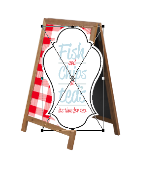
I have decreased opacity on stickers to 80%, the display board doesn't appear real.. it had no shadow or reflection therefore appears to be floating.


Making a shadow by following its angles and using the pavement shadow colour to fill in the shape.

 I have added a reflection in the window by duplicating the shape and reflecting it, also changing the perspective and skew. Then i layered it onto the window and reduced the opacity to 20%.

Finished store front.

Documenting our designs.

Me and alice wanted high quality images of our work, so the boards will do our pieces justice. Although we have good photography skills we got the help of my friend David Lindsay to photography our pieces effectively. I worked with Dave as an Art director, directing the photoshoot showing what shots we wanted.


Title Board.

 From the crit feedback we decided to make more of the title board, this board can then act as a description of the concept and would be a visually attractive way of introducing the idea to YCN.
We have created a border around the fish and chips title and added the gingham background to it to tie the idea together into a title.


Screenshot of new title board.
Continue design onto sandwich board for store front.