Who/ What am I?
Passionate, Hardworking, Good at idea generation, thinking outside the box, interaction between design and audience.
What i am interested in?
Design for retail, 360degree companies allowing me to work with a mixture of clients and projects covering a broad range of design, Fashion editorials, Packaging, Type & Layout.
YCN- Working with Alice Vine

Monday, 28 February 2011
Tuesday, 22 February 2011
Extra Reading Week Work
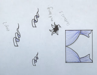
I really love the work that the image group are doing so i thought i'd try a few tasks in my week off to get a bit of drawing done.


Wednesday, 16 February 2011
OUGD202 Evaluation
Finally, a piece of work i'm proud of! This project was a huge confident boost for me definately what i needed after the disaster that was the print module. When I was first given the brief for Design for Screen I didn't know what to expect and certainly didn't think i'd enjoy it or be any good at, how wrong was I! I've found this project so inspiring and has shown me a totally different way to work. I have learnt so much about myself, the way in which i work has greatly improved but i think this has a lot to do with the structure of this project and the process of designing for screen was very step by step that really pushed me through my work. My time management has improved 100% and i have been so much more motivated then previous projects.
My title sequence has had many views, comments, such as comments below from Leigh Brown (Graphic Designer based in London) and David Lindsay (Photographer based in Leeds) ...and my friend Michael who has set up a film company wants me to do a title sequence for his new film, yey abit of work coming my way!


My title sequence has had many views, comments, such as comments below from Leigh Brown (Graphic Designer based in London) and David Lindsay (Photographer based in Leeds) ...and my friend Michael who has set up a film company wants me to do a title sequence for his new film, yey abit of work coming my way!


I have developed new skills within After Effects, not only have a learnt a whole new software within a very short time but learning a whole new way of working that comes with designing for screen. Taking all the taught sessions into consideration to help with my sequences, i became very fluent with working with After Effects and surprisingly didn't encountered any problems at all with the software, managing my files by clearly labelling and working from the same folder obviously payed off. I have furthered developed software skills on Photoshop and Illustrator whilst preparing my assets and the speed and ease of designing these increased throughout the project. When using After Effects I tried to stay away from using effects and presets and stuck with simple movements, cameras where needed and just let the concept and speak for itself.
I have researched idents and title sequences thoroughly to understand the structure which i can then create my own around so it will have a proffesional feel to it. I have exhausted my subject matter looking at books and acts and vintage circus', posters, objects and videos and these have all created a foundation for my ideas and visual appearence. Although i researched tv channels and target audience i was still quite confused where my programme may be viewed which i asked in each crit but didn't get back a clear answer, i feel i have chosen the most appropriate though. I have also done a little research into After Effects, looking at tutorials and back at our taught sessions for guidance which has furthered the technical side of the AE work.
I think my strengths lie in the visual communication, i thought about all aspects of its appearence when designing from choice of font, colour (desaturated tones), type of illustration used, the style of motion and the music. The music was so strong and made the piece what it is, working with the music and animation together helped me to strengthen the sequence and build up the fast, busy, overwhelming feeling of a circus. I wanted to create an older style as i thought it would make the target audience older which is who i wanted to target the work at, this concept for children would have created a cheesy look. The concepts for my sequences and idents were strong, i played around with a lot of ideas and the storyboards really helped me to visualise in 3d. I think they are clear to understand and show exactly how it will move. Recording ideas was also a strength, i kept my journal with me at all times to record rough ideas, thoughts, questions and notes which i can look back on, in recent projects i come up with an idea and forget about it so this has worked really well. My time management was really good aswell (finally), this is usually the weakest point of my project and i end up rushing to finish which results in poor final pieces but working for screen suits my style of working, every week i would write i checklist for the following week and then i tick list for each day helped me further my ideas, designs and final pieces and is so rewarding getting everything done on time! I also tried to think outside the box with my packaging and tried to create something that wasn't only fitting with the top 10 but that could be fun and interactive, because of my time management I was able to print my packaging to a professional standard.
My weaknesses would probably be not enough storyboarding ideas, also my and assets i used found images with some of my own illustrations i would have liked to have used all my own illustrations but it looked too much like a cartoon and lowered the audience age. The found images used were from books and the internet and i worked on them within photoshop adding colour and creating moving layers. My storyboards strengthened my ideas for the pieces without these i think my ideas would have become jumbled and plain. Although i feel as though i could have created my storyboards to further my ideas, showing smaller sections of the frames or working with flip books. Other weaknesses could be my technical skills of AE, I tried not to overcomplicate the motion and worked more with adding and subtracting layers to build up the scene.
Attendance: 5 Punctuality: 5 Motivation: 5 Commitment: 5
My motivation towards this module really shows through in my work, i've recieved great feedback from people that my work shows how engaged i was with it. Working on a piece for screen means you HAVE to be motivated and well organised, preparing assets and storyboards ready for making. I've been very committed, coming into uni at weekends and staying back until uni closes. Which i've enjoyed and has helped me seperate my work and social life and actually get a good nights sleep!
Quantity of Work Produced: 4 Quality of Work Produced: 5
The quantity of work is of a very high level although i feel i could have documented the work more on my blog. I feel that the work i have produced for final pieces is of a high standard not just visually but conceptually and technically.
Contribution to the Group: 5I think i shine when it comes to crits and helping others with ideas, i always try to input ideas or design work i have seen that applies to their project.


Tuesday, 15 February 2011
Problems with popcorn kernals in packaging!
The idea was to put popcorn kernals into the popcorn bag with the cd but when i opened an already existing microwave popcorn bag i found that the popcorn kernals was sooo sticky! It would have damaged the cd so i decided to create a seperate bag inside with the kernels taking the template from butterkist popcorn and applying it to my own bag... this gave me enough space to add instructions and warnings that were needed and also acted as a dvd cover!


When adding the kernals to the new packaging it created grease marks on the paper! ARGHHH! Should have used a grease proof paper instead!


When adding the kernals to the new packaging it created grease marks on the paper! ARGHHH! Should have used a grease proof paper instead!
ALL FINISHED AE
TITLE SEQUENCE FINISHED 50SECS from Stephanie Oglesby on Vimeo.
Untitled from Stephanie Oglesby on Vimeo.
IDENT 2 FINISHED from Stephanie Oglesby on Vimeo.
IDENT 3 NEEDS RELOADING TO VIMEO ACCOUNT
IDENT 4 FINISHED from Stephanie Oglesby on Vimeo.
Management of files
50second title sequence
All layers all colour coded corresponding to different assets

Pale Green- layers not to touch, adjustment layer, sound layer, super 8 film
Yellow- lion layers
Pink- acrobat layers
Green- Text layers
Purple- Additional layers
Orange- Lions 2
Brown- Compositions
To make the management of files within my title sequence clearer I colour coded throughout all my compositions with colours that corresponded to different assets (as shown above). All of my assets were imported as groups ie/ all acrobats in one file, all lions in another etc. Each layer was also layered apropriately to reduce confusion and ease quickness of use. I created certain compositions seperately and added them into the main 50second title sequence, this reduced the number of layers.
Monday, 14 February 2011
DVD packaging and label


Packaging main Faces

Packaging net ready to print

DVD label ready to print
As the bag will be microwaved I printed the net onto fire resistant paper, this had a nice quality the paper it felt handmade and although i liked this it did not suit the sweetbag style, i needed thin cheap paper and preferably not white as this looked too bright and didn't go with the vintage feel. I printed instead onto brown paper, as microwave bags i had found within my research used this paper plus it worked well with the burgundy and black adding to the old style of the piece.
As the bag will be microwaved I printed the net onto fire resistant paper, this had a nice quality the paper it felt handmade and although i liked this it did not suit the sweetbag style, i needed thin cheap paper and preferably not white as this looked too bright and didn't go with the vintage feel. I printed instead onto brown paper, as microwave bags i had found within my research used this paper plus it worked well with the burgundy and black adding to the old style of the piece.


Sunday, 13 February 2011
All Title Sequence!
All title sequence 1 from Stephanie Oglesby on Vimeo.
Added film burn to the final 5seconds to blend the animation into the ending frame, a preset effect used on after effects.
Untitled from Stephanie Oglesby on Vimeo.
I have used a film burn to make the title sequence appear like an old super 8 film, it adds to the dark vintage style of the piece.
Saturday, 12 February 2011
New packaging idea and mock up
After thinking about what is in the circus that i can relate to packaging i had a few ideas like balloons,
tickets/ tokens or popcorn carts/ bags. I like the idea of packaging the cd within a popcorn bag so when the circus pieces are viewed you can eat the popcorn with it. I like the interaction between the packaging and the product, it connects well to how a circus show would be watched.
If i package a microwave popcorn bag instead of ready made popcorn then the bag will be flatter easier to distribute.
Look on Design Context for research on popcorn bags!
Friday, 11 February 2011
Ident Acrobat
Using the acrobats from the main title sequence, i have created a new sequence with them and incorporated the ending into the 10second ident.
The final FIVE logo uses one of the acrobats within it to continue the theme.
Untitled from Stephanie Oglesby on Vimeo.
The final FIVE logo uses one of the acrobats within it to continue the theme.
Untitled from Stephanie Oglesby on Vimeo.
Thursday, 10 February 2011
Ending for all idents
I will use the same ending for all the 4 idents, a 5second sequence which leave me with a 5 second intro to adapt to each ident. The channel 5 logo will incorporate parts of each ident within it.
Untitled from Stephanie Oglesby on Vimeo.
This doesn't allow me too much variation between sets so i have created a alternate version.
Untitled from Stephanie Oglesby on Vimeo.
I like the frame ideas these could have name tags corresponding to the act show in the frame.
Untitled from Stephanie Oglesby on Vimeo.
This doesn't allow me too much variation between sets so i have created a alternate version.
Untitled from Stephanie Oglesby on Vimeo.
I like the frame ideas these could have name tags corresponding to the act show in the frame.
Wednesday, 9 February 2011


Packaging Ideas
Quick ideas

1. Laser cut faces laying over each other to make layers like title sequence, when viewed from the front all layers make one image, set and acts.
2. I fold out packaging where the curtains part revealing rest of set and cd


1. Laser cut faces laying over each other to make layers like title sequence, when viewed from the front all layers make one image, set and acts.
2. I fold out packaging where the curtains part revealing rest of set and cd

3. Packaging builds up to make a circus tent and folds back down into the lid.
Tuesday, 8 February 2011
Further Sequence development.
I would like to add more imagery to the last 15 seconds, make the acrobats movement be the background and animate infront of this.

Add Frames to the type.

End Frame development.


Add Frames to the type.

End Frame development.


I have added extra type layers to fit with narrative, this helps to break up the animation and makes it appear more like a title sequence, also the sound strengthens the visuals and highlights key parts of the sequence. The relationship between sound and type and sound and image has been thought about carefully so they work hand in hand and are there to ease the viewing.
I have also added frames for the type as this works well with the circus theme, ornate frames... may use a light tutorial to make the signs light up! I have also corrected the elephant sequence and changed the cartoon 'booooom' bubble to 'wildly entertaining' to match the narrative.
Untitled from SJO on Vimeo.
New Soundtrack
Searching for a ringmaster announcement 'Ladies & Gentlemen' on youtube i came across this clip from Christina Aguilera's Circus Live Show, I think this piece of music works so much better with the sequence and adds a dark/ old undertone to the piece which is the style i want to create.... this music along with the super 8mm film layer on the sequence adds to the vintage feel and creates a dark circus/ carnival.
Below i have storyboarded the main title sequence to see where i need to adapt the assets to make the sequence fit with the music... the track uses narrative which allows me to use kinetic type within my piece.

(relative to length of soundtrack)
Clips showing music matching narrative.
Music Added to Sequence
Untitled from SJO on Vimeo.
Using 8mm film reel clip.
Throughout making my title sequence and assets i knew the style wasn't right, it looked to bright and shiny and didn't suit the vintage circus look i wanted to create.
I played around with the assets changing the saturation and hue and applying a sepia photo filter onto each asset but this still didn't look 'old'. The colours in the images started to clash between the varying saturations.
I started experimenting with the film grain and scratchy film effects within AE which led me onto tutorials on the internet where i found this...


Untitled from SJO on Vimeo.
I played around with the assets changing the saturation and hue and applying a sepia photo filter onto each asset but this still didn't look 'old'. The colours in the images started to clash between the varying saturations.
I started experimenting with the film grain and scratchy film effects within AE which led me onto tutorials on the internet where i found this...


...a relatively simple way to create an old film look by applying an 8mm film clip found on youtube as a new layer on AE


...then applying an adjustment layer on top which would effect every layer, within the adjustment layer i changed the CC colour tone to a sepia tint which added to the old look

VIDEO WITH 8mm Film Clip
End 15 seconds
Sunday, 6 February 2011
storyboards for main sequence
I have reached a point where i have a definate beginning and end and i have an idea of what is happening in the main sequence but i don't want it to turn into an animation. Entering the circus tent in the main section of the sequence narrows the space i have in which to work in, the set created with everything moving in one space creates the feeling of an animation. To break this up I want to create frames that pull you back out of the main set.
Storyboard ideas below.
Acts to include in the main sequence-
Lions, acrobats, elephants, human freakshow, jugglers/ clowns, strongman.
the middle sequence is around 35secs.


Storyboard ideas below.
Acts to include in the main sequence-
Lions, acrobats, elephants, human freakshow, jugglers/ clowns, strongman.
the middle sequence is around 35secs.


Wednesday, 2 February 2011
Assets
Today I am going to draw into some of my assets because i don't like how simple they are, i want to make my own background for the circus tent and curtains and draw into the tent illustration.
ALL ILLUSTRATION.


ALL ILLUSTRATION.


Subscribe to:
Comments (Atom)