1. What skills have you developed through this module and how effectively do you think you have applied them?
I have learnt a great deal within this module through workshops and taught sessions which has led me to understand the technicalities of Graphic Design. I am a lot more aware of how to design, the specifications such as file formats, colour and what .... The taught sessions with Lorenzo along with the trip to Team Impression really opened my eyes to the world of print and helped me to understand and identify the differences in processes and finishes available. It was so helpful seeing a working print room to understand the logistics of designing for print. I have definately investigated further into different formats, stocks and print processes aswell as print finishes. I have tried to apply some of the print finishes to my own work such as foiling and embossing, these added a higher quality to my work and i now understand how they are used within print production, also how quick and simple the processes can be. I have been a lot more aware of colour, creating suitable colour palettes, matching colours using pantone charts and creating my own swatch palettes which i applied to my design work. Developing ideas for packaging allowed me to investigate and be creative with packaging design, although i occurred mistakes along the way i have created a good understand of what is/ what is not possible to design. Applying my knowledge of designing for print production is more effectively seen by creating the pdf's, the correct artwork to be sent to print, here I had to take into account what I have learnt from the taught sessions and apply it to my own designs. I feel like i have developed my skills in Indesign and illustrator a lot more in this project, creating nets and the final boards really helped me to push my knowledge of the programme, although at first i felt like i had jumped in at the deep end and was quite baffled by all the information i had learn but by re-reading notes and asking for help when needed now i feel a lot more confident within using these programmes and also using the programmes with each other. I have found note taking so important this module as there has been so much to learn, also for quick design ideas, i have jotted ideas down as soon as they have come to me which has helped with developing designs.
2. What approaches to/methods of research have you developed and how have they informed your design development process?
The research collected has had huge effects on my design development, i have thoroughly enjoyed researching print from all printed pieces to more specified works to parallel and inform my own project. As i now understand more about print processes when looking at works i was able to see how they had been made, how possible it is to use similar processes within my own work and has allowed me to make evaluations of work. Collecting research on my subject i found a little harder, they was a lot of secondary research available yet i struggled when investigating primary data. I also tried to get in touch with the right people through email but unfortunately had no replies so important information needed was lost.
3. What strengths can you identify in your work and how have/will you capitalise on these?
I think my strengths have shown to be concepts and idea generation unfortunately I find it difficult to go through with designs due to lack of knowledge of software skills which i have developed a better understanding of throughout this project and know that i could apply these a lot better now to future projects. I think my strengths lie in research in particular investigating other designers work, i have loved exploring what is out there in the design world today and my new found knowledge of print processes has allowed me to understand how they have been produced.
4. What weaknesses can you identify in your work and how will you address these more fully?
I felt like a struggled a lot with this project when it came to actually designing and really let myself down, now reaching the end of the project i can see all the design possibilities and problems within my concept and i would love to be able to re do this project with all the skills and knowledge i have now developed.
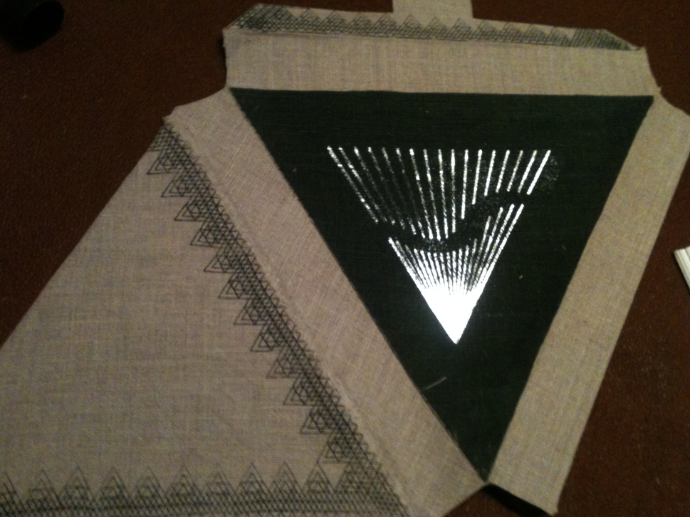
The crafting of my final pieces are extremely weak and mainly handmade, this is due to bad time management. I did too much thinking, running round in circles and over complicating things which people mentioned in my crits. The overall poor quality of the designed pieces was due to not investigating key things when it came to stocks, although i investigated printing onto the stock i didn't investigate what stocks i could use for certain packaging and this created a lot of problems.
5. Identify five things that you will do differently next time and what do you expect to gain from doing these?
I already feel that if i had to re do the project i know exactly where i went wrong and how i would do it differently.
I over complicated my actually concept making it too specific and difficult to design for, instead of doing 'engaging with music' designs for Fever Ray i would just create work for 'engaging with music' making it so much broader already opens doors to more design possibilites and the ability to create branding and a range.
Use my knowledge that i have developed for print processes more effectively, actually digitally print more, i feel like screen printing took over and was almost a way to avoid digitally printing.
Collect more primary research would have enabled me to design more specific for the audience.
I think i thought about product to much and not the actual designs, i need to remember i am a graphic designer and not a product designer or art director.
Keeping upto date with my blog, unleashing a list of problems in my time management but i think this was mainly due to being confused with my project. Yet instead of writing down all my problems day to day i only put up work that i had actually done/ designed. It sounds sillly but i started this project confidently and week by week lost confidence in myself as a designer and doubted my abilities and position on this course, all of a sudden it hit me that this is the real thing, it scared me and stopped me from designing I got stressed very easily and this affected my work. There is nothing i can do now but reflect on this project and rebuild my confidence, i can't wait to start a fresh having learnt more skills and a greater understanding and develop some amazing work.
6.How would you grade yourself on the following areas:
Attendance: 5
My attendance for this year is very high i think i have only missed one session and this was due to illness
Punctuality: 4
Motivation: 3
I have struggled with motivation as i found myself getting confused a lot with my ideas
Commitment: 3
Due to confusing myself with ideas.
Quantity of Work Produced: 3
I feel like i have designed quite a lot, maybe too many final resolutions which in turn made each one a lower quality
Quality of Work Produced: 2
I think the quality of work produced is quite poor due to the packaging solutions going wrong
Contribution to the Group: 5
I think i shine when it comes to crits and helping others with ideas, i always try to input ideas or design work i have seen that applies to their project.